Same as what is said above, the hybrid is designed to be used with a mouse/keyboard and not a touch screen. Most of the issues could be resolved if this was designed for touch screen like the old app is.
Specifc issues though are:
The navigation is difficult to use, too small, screens overlap.
I had an incoming attack and was trying to dodge and nearly missed it as I was trying to get to the map screen to select a city and it just wasn't allowing me to click the buttons.
Trade is difficult, even with the drag icons they seem to not always allow you to select, manually typing in or trying to use the tiny scroll.
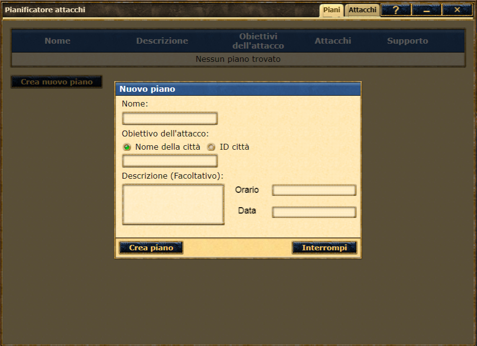
Typing anything in is impossible, it doesn't let you see the text you are typing, if you make a mistake you can't see where and have to guess as you try to delete or change spelling.
Searching on players or cities etc doesn't work or if you go to ranking and try to search on a player/alliance/city etc the text box blocks the search results so you can't select any.
The map is difficult to use, the zoom only allows to a certain ratio, on the old app it was really useful to be able to zoom in and out with your fingers.
It would be good to have the screens to open in full such as senate, academy.
The spells are really difficult, the old app was great for a quick view of active spells. Now you have to hover over each spell individually, dealing with the hover function as well.
Islands quests, it's hard to see that the criteria is without using the hover and risk selecting the challenge instead of just trying to see this.
I haven't had the issues with lag or alarm etc. that others seem to have though and it's faster than the old app most of the time, does sometimes get stuck on loading up but otherwise that has been fine.